In Defense of Fahrenheit
On a scale of 0 to 100, how warm is it? The Fahrenheit scale nearly perfectly captures the distribution of U.S. daily temperatures.
May 24, 2019 (Fahrenheit's 333rd birthday)
A little while ago I was eating lunch when I overheard a nearby conversation about temperature scales. The topic of discussion was the bizarre underpinnings of the Fahrenheit scale and the hope that the U.S. would someday switch to Celsius.
Everyone who has taken a chemistry class knows that the Celsius scale is better because it's in the metric system, and it has a clear definition: 0℃ is the freezing point of water, and 100℃ is the boiling point. Reference points such as these are how a temperature scale is defined. The Fahrenheit scale was defined to have 0℉ be the temperature of a particular freezing brine solution, 32℉ the freezing point of water, and 96℉ body temperature (later corrected). Obviously a much less intuitive temperature system!
But I've never been totally sold on the Celsius system either for day-to-day weather. And not because I've never used it—I've spent about 15% of my adult life in Europe. I found it annoying to use negative numbers for temperatures that aren't really that cold, and then have 35℃ be grossly hot. The truth is, outside of a chemistry lab I don't care that much about the freezing and boiling points of water; I care mostly about how hot or cold it will be this week. To me, the Celsius scale seems not-ideally calibrated for that purpose.
This conversation got me thinking—we all know Fahrenheit is bad, but what would be an ideal temperature scale for daily weather? What if instead of worrying about historic temperature reference points, we just look at the immense amount of temperature data now available and create a new temperature scale that is calibrated to the daily temperatures we all experience?
A data-driven temperature scale
Suppose you're given the opportunity to create a new temperature scale for day-to-day weather. What properties should it have? For me, I'd want it to:
- Capture typical temperatures on an intuitive scale, like 0 to 10 or 0 to 100. People are comfortable with these scales, and Celsius's use of 0 and 100 for his scale is a big part of what makes its definition natural to people.
- Avoid decimals for day-to-day levels of precision. We can't capture typical temperatures on a scale of 0 to 10 without using decimals, so that leaves 0 to 100 as the best choice.
- Avoid negative numbers. Who wants to use negative numbers all the time when we can adjust 0 so that we don't need to? I'd want 0 to be cold enough that the temperature is only rarely below 0.
- Avoid 3-digit numbers. We can easily avoid negative numbers by using the Kelvin system, but today's high of 294 degrees is a bit unwieldy. Let's set 100 to be hot enough that the temperature is only rarely above 100.
My ideal temperature scale sets 0 and 100 based on actual daily temperatures, rather than the freezing and boiling points of water or other chemical properties. We can take a look at temperature data to decide exactly where those reference points should be set.
The population-weighted temperature distribution
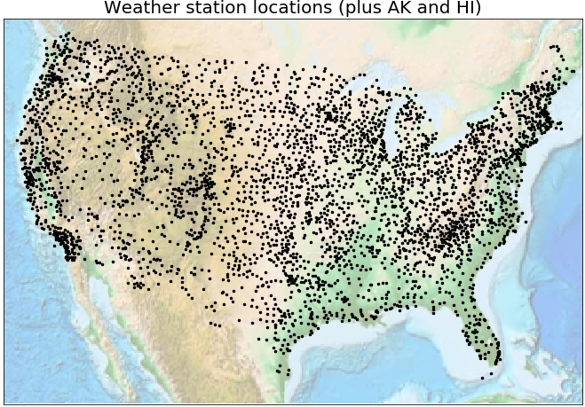
NOAA tracks daily temperatures at thousands of weather stations across the U.S. I pulled daily highs and lows for every day in 2018 for every zip code that has a weather station. After a bit of data cleaning, this produced a year's worth of daily observations at 3944 points in the country. This map shows the locations of the weather stations for which I pulled data (along with a number of stations in Alaska and Hawaii not shown in the map):
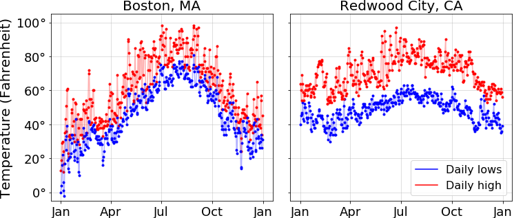
For every one of those 3944 stations, we have the recorded high and low for each day of 2018. Here's what that data look like for two of the stations (Boston MA and Redwood City CA, which claims to have the best climate in the country):
Our goal is to use these data to estimate the distribution of temperatures that people experience in the U.S. Simply combining the data from all of these stations directly would not be quite what we want, because each station represents the daily highs and lows for a different number of people. For the purposes of identifying typical temperatures, we don't want to give the Barrow Alaska weather station (population 4213, 2018 low of -37℉) the same weight as the La Guardia airport weather station.
If you choose a person in the U.S. at random and a day of the year at random, what will be the daily high and low for that person? I call that the population-weighted temperature distribution, and that is estimated here by combining the weather station data above with population data from the 2010 U.S. Census, available by zip code. The population from each zip in the census is given to its nearest weather station as a weight, and then we combine the daily highs and lows with these weights into a single distribution for highs and a single distribution for lows.
This figure shows the population-weighted temperature distribution of the U.S. The unit on the y-axis is person-days, meaning for each temperature on the x-axis, it is the total number of persons times days that had that temperature as the high or low respectively.
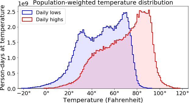
As one might expect, we see a pretty broad range of temperatures across the country, with large populations in places like California and Florida driving a bias towards warmer temperatures.
Defining the temperature scale
Now that we know the distribution of temperatures experienced by people in the U.S., we can decide where to place 0 and 100 on our data-driven temperature scale. Here a natural approach is to use percentiles of the distributions. Basically, we can decide what percent of the time we want to have to use negative numbers, and set 0 to be that percentile. Similarly, we can decide what percent of the time we want to have to use 3-digit numbers and set 100 accordingly. This plot shows the percentiles of the population-weighted high and low temperature distributions:
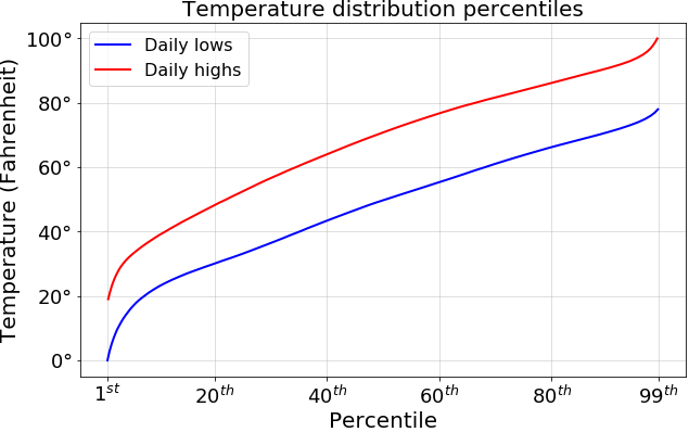
The remarkable result here is that 0℉ is nearly exactly the 1st percentile of daily lows, and 100℉ is nearly exactly the 99th percentile of daily highs. What does this mean? Well suppose for our data-driven temperature scale we want to set 0 so that we only require negative numbers 1% of the time, and 100 so that we only require 3-digit numbers 1% of the time. This seems like a great choice to me, and is exactly what the Fahrenheit scale gives.
The practicality of Fahrenheit
Given its odd set of reference points, why was the Fahrenheit scale every popular in the first place? It's because of his advances in engineering. Daniel Gabriel Fahrenheit designed and built the first thermometer that reliably and accurately worked (the mercury-in-glass style still in use today). He put his temperature scale on his thermometers, and by virtue of being the best thermometers, his became the standard temperature scale. The usage of the Fahrenheit scale has thus from the very start been centered in practicality. And when it comes to capturing temperatures in the U.S. on an intuitive scale, the data are clear: it'd be hard to come up with a better choice.
So then is Fahrenheit the best temperature scale? The superiority of the Fahrenheit or Celsius scales has been endlessly debated on a number of points (for instance: pro-F, rebuttal, pro-F, lengthy debate). I think the reality is that the best temperature scale is the one that you're most familiar with, i.e., the one you grew up using. For many people that's Celsius, but for many others it's Fahrenheit. We needn't denigrate the Fahrenheit scale because of its odd set of reference points—when it comes to its practical usefulness for day-to-day temperature measurement, it has all of the properties I would want in a temperature scale. On a scale of 0 to 100, how warm is it? Just ask Fahrenheit.
The temperature and population data used for this post, along with code to generate all of the figures, is available on github.
Fun fact: Fahrenheit wrote a paper about his temperature scale in 1724, which you can read here (assuming, of course, you can read Latin. A portion of it is translated here).
Comments? Email me at bletham@gmail.com.